
How to Improve Mobile User Experience
April 20, 2015
Back in February 2015, Google published a blog post on its Webmaster Central Blog that has been getting a lot of attention. According to Google:
Starting April 21, mobile-friendliness will become one of the ranking signals. This change will affect mobile searches in all languages worldwide and will have a significant impact on our search results. Consequently, users will find it easier to get relevant, high-quality search results that are optimized for their devices.
You can read to full text at Google Webmaster Central Blog.
While having a mobile-friendly website is critical, what is often lost in these discussions in the usability and user experience parts of web design and that’s what we want to focus in this post.
For example, a significant number of legacy websites will probably put in a quick fix to comply with Google similar to the one shown in figure 1 below:
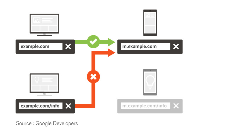
 However, this is not an acceptable solution when you consider UE or UX pieces. To understand this, you have to think from a user’s perspective. Let’s say you do Google Search on your smartphone and click on a promising-looking result, only to end up on the mobile site’s homepage, with no idea why the page you were hoping to see vanished? This is such a common annoyance, and it usually happens because the website is not correctly set up to handle requests from smartphones and sends you to its smartphone homepage. Google calls this “faulty redirect” since it redirects users to irrelevant pages causing frustration and annoyance. Take a look at figure 2 for a better explanation.
 Google reports these redirects to your Google Search Console under URL Errors. You can view them by visiting Crawl > Crawl Errors page under the Smartphones tab.
However, this is not an acceptable solution when you consider UE or UX pieces. To understand this, you have to think from a user’s perspective. Let’s say you do Google Search on your smartphone and click on a promising-looking result, only to end up on the mobile site’s homepage, with no idea why the page you were hoping to see vanished? This is such a common annoyance, and it usually happens because the website is not correctly set up to handle requests from smartphones and sends you to its smartphone homepage. Google calls this “faulty redirect” since it redirects users to irrelevant pages causing frustration and annoyance. Take a look at figure 2 for a better explanation.
Google reports these redirects to your Google Search Console under URL Errors. You can view them by visiting Crawl > Crawl Errors page under the Smartphones tab.
How to Improve Mobile User Experience
To provide an exceptional user experience on smartphones, you should do few things:- Start with Google Webmaster Tools and investigate any faulty redirects.
- If you have a dedicated mobile website, you should redirect smartphone users to the equivalent URL on your mobile site.
- If a page on your site doesn’t have a smartphone equivalent, keep users on the desktop page, rather than redirecting them to the smartphone site’s homepage. Doing nothing is better than doing something wrong in this case.
- Develop your website using responsive web design, which serves the same content for desktop and smartphone users. According to Google, responsive design is their recommended design pattern.